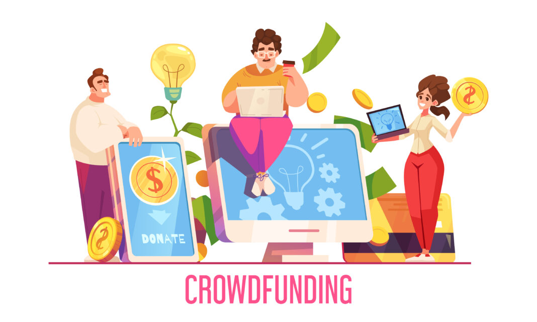
The success of a crowdfunding app largely depends on its user experience (UX) and user interface (UI) design. In an industry where trust, engagement, and ease of use are vital, a well-designed app can significantly attract and retain users. Good UX/UI ensures users can easily navigate the platform, create campaigns, and make contributions smoothly. For a crowdfunding app development company, focusing on UX/UI design can set them apart in the competitive market.
In this blog, we’ll explore the best practices for designing UX/UI for crowdfunding apps, how these design choices can boost user engagement, and why it’s crucial for a crowdfunding app development company to prioritize effective UX/UI.
Why UX/UI Matters in Crowdfunding Apps
Before jumping into best practices, let’s understand why UX/UI design is so essential for crowdfunding apps. Crowdfunding platforms need to attract two key user groups:
- Campaign Creators – Individuals or organizations looking to raise funds.
- Backers – Users who are willing to support these campaigns financially.
If the app is hard to navigate or confusing, both groups may get frustrated and abandon the platform. Effective UX/UI design builds trust, ensures users can easily find information, and makes the process of creating and supporting campaigns simple. For a crowdfunding app development company, a seamless user experience can lead to higher conversion rates, increased user retention, and ultimately, more successful campaigns.
Best Practices for Crowdfunding App UX/UI Design
1. Simplify the Onboarding Process
The onboarding process is the user’s first experience with the app, and a smooth, informative start can set a positive tone. Here’s how to do it right:
- Clear Instructions: Use simple, clear instructions during onboarding. Make sure users understand how to navigate, create campaigns, and contribute.
- Minimize Required Inputs: Don’t overwhelm users by asking for too much information right away. Allow them to sign up using existing accounts (like social media or Google) for easy access.
- Interactive Tutorials: Consider using guided tours or interactive tutorials to help new users get familiar with the app’s features. This reduces confusion and makes the experience more engaging.
2. Focus on Visual Design and Layout
The visual design of the app plays a significant role in attracting users and keeping them engaged. A professional and visually appealing interface builds trust, which is crucial for crowdfunding platforms.
- Consistent Branding: Make sure the app’s design matches the overall brand aesthetic. Consistent branding makes the app more recognizable and trustworthy.
- Clean and Intuitive Layout: Avoid clutter. A clean, organized layout ensures users can navigate the app easily without feeling overwhelmed.
- Effective Use of Colors: Use colors strategically to draw attention to important elements, like call-to-action buttons. The right color scheme can also evoke emotions that encourage users to engage and support campaigns.
3. Easy Navigation with Intuitive Menus
Good UX design ensures users can navigate the app effortlessly. A crowdfunding app development company should prioritize simple, intuitive navigation to help users find what they need quickly.
- Clear Menu Options: Use simple, descriptive labels for menu options. Users should know exactly where each button leads without guessing.
- Quick Access to Key Features: Make sure important features, like creating campaigns or browsing projects, are easily accessible from the main menu. Consider using sticky navigation to keep key options visible at all times.
4. Streamline the Campaign Creation Process
The heart of any crowdfunding app is the campaign creation process. Making this process easy and straightforward can significantly improve user engagement.
- Step-by-Step Campaign Setup: Break down the process into clear, simple steps. Use a progress bar to show how far users have come and what’s left.
- Pre-Designed Templates: Provide templates for campaign pages to help users set up projects quickly. This ensures consistency across the platform.
- Helpful Tips and Guidance: Offer tips throughout the process to help users craft effective project descriptions and choose the right visuals.
5. Showcase Successful Campaigns to Build Trust
Building trust is crucial for a crowdfunding platform. Users need to feel confident that the projects they support are legitimate and that their funds are secure.
- Feature Success Stories: Highlight successful campaigns on the homepage. This shows that the platform works and builds trust.
- Verification Badges: Add badges to profiles of verified campaign creators to increase credibility. This can encourage more users to contribute to their projects.
- Transparency in Funding: Clearly show how funds are distributed to campaigners and how backers can track the progress of projects they support. Be transparent about any associated fees.
6. Simplify the Contribution Process
The process of contributing to a campaign should be quick and straightforward. Any friction could lead to abandoned contributions, affecting campaign success.
- Multiple Payment Options: Offer different payment methods to suit various user preferences, including credit/debit cards, PayPal, and digital wallets.
- Secure Payment Gateway: Security is a top priority. Use secure payment gateways to ensure transactions are safe and encrypted.
- One-Click Contributions: Make it easy for returning users to contribute by offering one-click payment options. This reduces friction and speeds up the process.
Role of a Crowdfunding App Development Company in UX/UI Design
A crowdfunding app development company plays a critical role in creating an app that meets the needs of both campaign creators and backers. This involves understanding user behavior, technical expertise, and a focus on delivering an excellent user experience.
- User Research and Testing: Experienced developers conduct user research to understand what users expect from a crowdfunding app. Regular testing ensures any necessary improvements to the UX/UI design are made.
- Security and Compliance: A trusted crowdfunding app development company ensures the platform complies with regulations and integrates security measures to protect user data and funds.
- Feedback Loops: Successful apps evolve based on user feedback. Development companies should implement feedback loops to gather insights and make data-driven improvements to the UX/UI design.
Emerging Trends in Crowdfunding App UX/UI Design
As technology evolves, new trends are shaping the future of crowdfunding app UX/UI design. A crowdfunding app development company that stays ahead of these trends can build cutting-edge platforms that attract more users.
a. AI-Powered Personalization
AI can analyze user behavior to provide personalized recommendations, like suggesting relevant campaigns based on users’ past contributions. Personalized experiences can boost engagement and encourage more support for campaigns.
b. Voice Interface
Integrating voice commands into crowdfunding apps can offer a hands-free way for users to navigate, find campaigns, and make contributions.
c. Gamification Elements
Adding gamification features like progress bars, reward points, and badges can make the app more engaging. These elements encourage users to participate more actively.
Conclusion
Effective UX/UI design is essential for the success of crowdfunding apps. For a crowdfunding app development company, focusing on creating a user-friendly, engaging, and secure platform is key to standing out in a competitive market. By incorporating the best practices outlined in this blog, developers can build platforms that attract more users, support more campaigns, and ultimately achieve greater success.


